
Wednesday, 30 March 2016
Wednesday, 23 March 2016

Analysing my Movie Magazine Audience Feedback

After creating a feedback page on Surveymonkey.com, I received four comments on how to improve my movie magazine cover. I did take some of the comments into account, for example... I decided to change the colour and size of the typeface saying - "Joseph Mcveigh" as I wanted to make his name stand out as a main feature. I also added in a website for the magazine, located below the feature which says - "Your 30 greatest Star Wars characters ever!". I also took into account the comment on removing space between "Sienna Miller's" name. I done this and instantly noticed the significant difference it made. I was then able to add in another feature saying "Limited Edition" which made my magazine look more busy and authentic. It also added a reason for my consumers to buy the magazine as a USP.
Tuesday, 22 March 2016
First draft of my Movie Magazine Cover


Tuesday, 15 March 2016
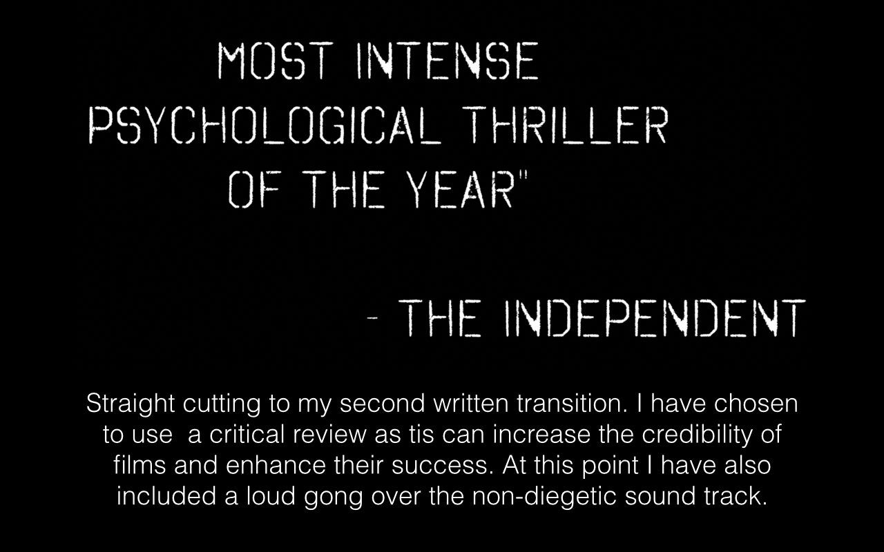
Friday, 11 March 2016


Thursday, 10 March 2016


Tuesday, 8 March 2016
Final Draft of my Movie Posters
 |
| I believe having the tagline in the middle of the poster does challenge the typical codes and conventions of various movie posters. Hopefully this will be one reason why my poster stands out as unique. |
 |
| This is my final design for my landscape movie poster. I think the blurring glow is a great effect for the background of the image as it adds to the suspense and mystery within my genre. |
Third Draft of my Movie Poster
 |
| After all of my changes. This is what I have done to improve my movie poster further... |
 |
| After further target audience feedback I realised I had a typo in the tagline - "A Wicked Psycho Thriller." I quickly adjusted it and then decided to change majority of my text to white instead of grey. I think this makes my text stand out more and will therefore, be more luring for my target audience. |
 |
| For my caption - "A film directed by Shelly Mcveigh" I decided to put an overlay of colour using the FX option. I increased the black and moved it slightly so the transition from white to black would be as seamless as I could possibly make it. I think by simply adding this colour overlay it has helped the overall look of the poster increase. |
 |
| For my poster to look as professional as possible, I have added in the registered trademark symbol at the end of my billing credits on each of my posters. |
 |
| For my portrait poster I have added in the Parental trademark in the lower right section of my poster. Again, this is to increase authenticity. |
Subscribe to:
Comments (Atom)